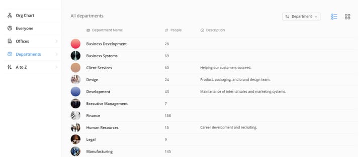
Add Image Backgrounds to Departments
You're now able to add image backgrounds to departments in the same way as you can for offices.
To add a background image to a department, switch to edit mode, edit the department by clicking the pencil icon, then upload an image using the image upload controls (drag/